Platform and marketplace payment flows are ever-innovating, and Mangopay is at the heart of powering this innovation, and its new brand positions this brilliantly.
It’s hard (and quite shocking 😮) to believe it’s been ten years since our brand was visually updated. Of course, a brand is so much more than a logo and a palette, and whilst every aspect of our brand for those ten years has held true to our mission to provide the most comprehensive and modular payment infrastructure for platforms and marketplaces, we felt a new visual identity was needed to truly demonstrate our ambition of being the global leader in providing payment infrastructure to build any powerful marketplace and platform payment flow.
As we move closer to our mission with new strategic partners that strengthen our product capabilities - from alternative payment methods, reliable acceptance engine, multi-currency and method payouts to fast identity management, flexible e-wallet infrastructure, intelligent fraud prevention, and a powerful payment orchestration layer - we’re more equipped than ever to empower ambitious platforms and marketplaces, big and small, to build, run and operate the payment infrastructure and payment operations they need to succeed.
Meet our new brand
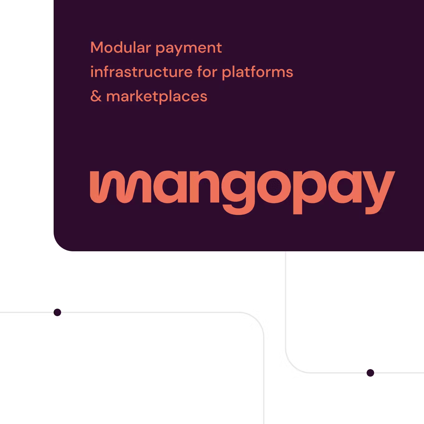
Our new branding is a complete overhaul of our previous design. We refreshed the Mangopay logo, updated our color palette and even created new brand identifiers.
We wanted to do away with the bright orange that was too prominent and slightly overwhelming in our communication but still keep hints of it here and there as part of our DNA.
We set out to create a logo that was easy to read, but not boring, and a color palette that was solid but subtle enough to play around with.
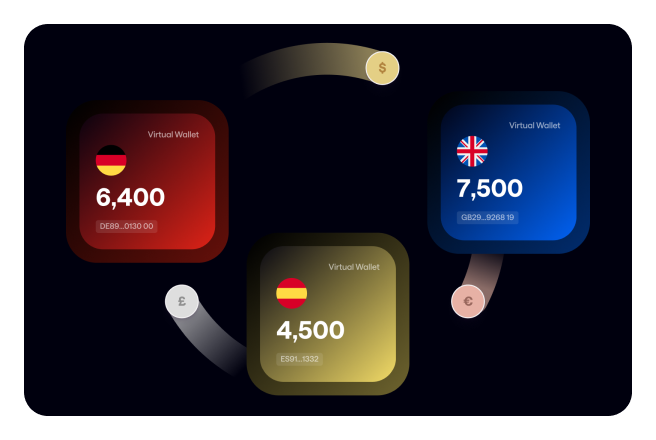
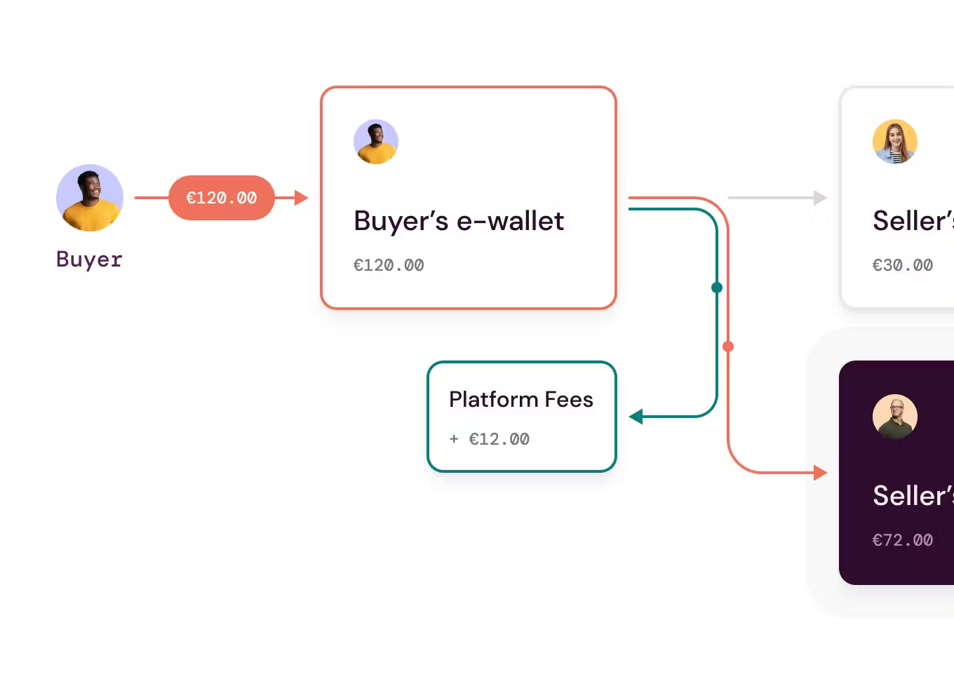
We wanted to represent the idea of money movements in the platform environment.
Our new look
So here it is!
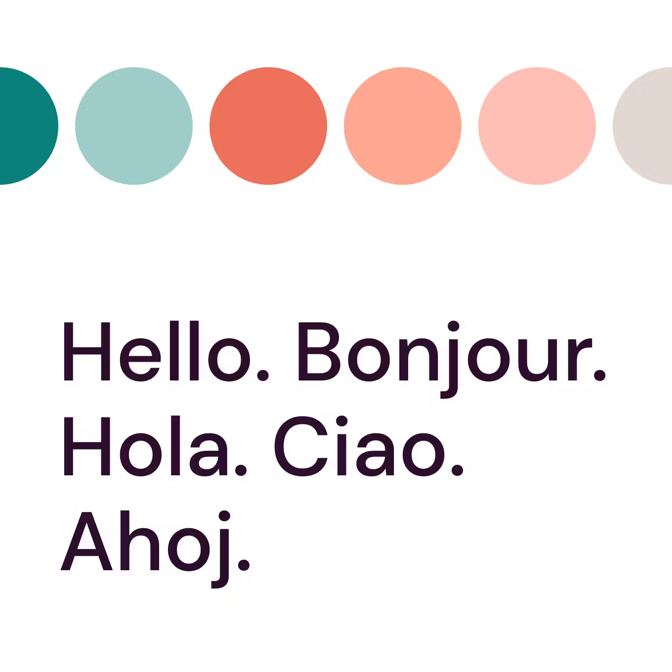
A richer color palette that retains a zest of orange while introducing new shades that showcase our versatility.
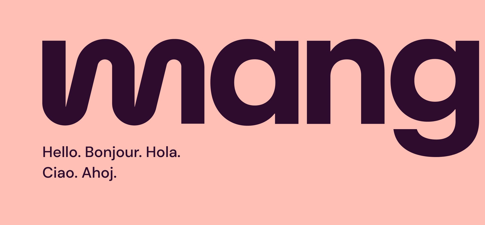
A modern font that is bold enough to be seen, combined with a flexible and rounder “m”.

Stylized representations of payment flows have been sprinkled across our interfaces as a nod to our seamless solutions.
Going with the flow
So that’s a brief introduction to our new brand. A brand to inspire platforms to build the payment flows they need to succeed and delight their users. A brand to excite those who want to join our mission and commitment to diversity, entrepreneurship and collaboration.
Conclusion
A rebranding is a true milestone for any company, and we are excited to continue building on this platform in the years to come.
We are always looking for ways to improve and grow, and this new image reflects that. We hope you enjoy our new website and branding. Beyond this new image, we are more than ever committed to providing platforms and marketplaces with powerful and complete payment solutions that enable them to grow.